Visible Tourism, aimed at becoming a leading digital solution in tourism service design, required a user-friendly and informative website for enhancing their online presence. The project emphasized a modern, playful, and professional appearance with a focus on tourism-centered UX/UI solutions and unique visitor pathways. Key features included multilingual support, integrated appointment booking, and a comprehensive structure covering essential aspects like services, portfolio, and blog.
Faced with the challenge of creating a comprehensive brand identity and website within a tight deadline, we set out to deliver a product that was both professional and quickly realized.
A New Beginning
My comprehensive understanding of Visible Tourism’s business goals allowed us to create a cohesive design across all elements, fitting everything into an incredibly short timeframe of just one month. This holistic approach was key to the project’s swift and successful completion.
Our journey began with the branding. Without existing guidelines, we embraced the freedom to create something fresh and minimal, yet vibrant. The initial color palette of purple and orange evolved into soothing shades of blue and purple, in response to client feedback.
EARLY STYLE EXPLORATIONS
The ID
Central to the branding was the innovative logo design – a stylized „V” with a partially obscured dot at its center, symbolizing the ‘pearl’ of discovery in tourism. This theme of partial visibility was further expressed through semi-transparent glass effects and blurred objects, embodying the company’s name in its visual language.
LOGO EXPLORATION
FINAL LOGO
CONCEPT
VARIATIONS
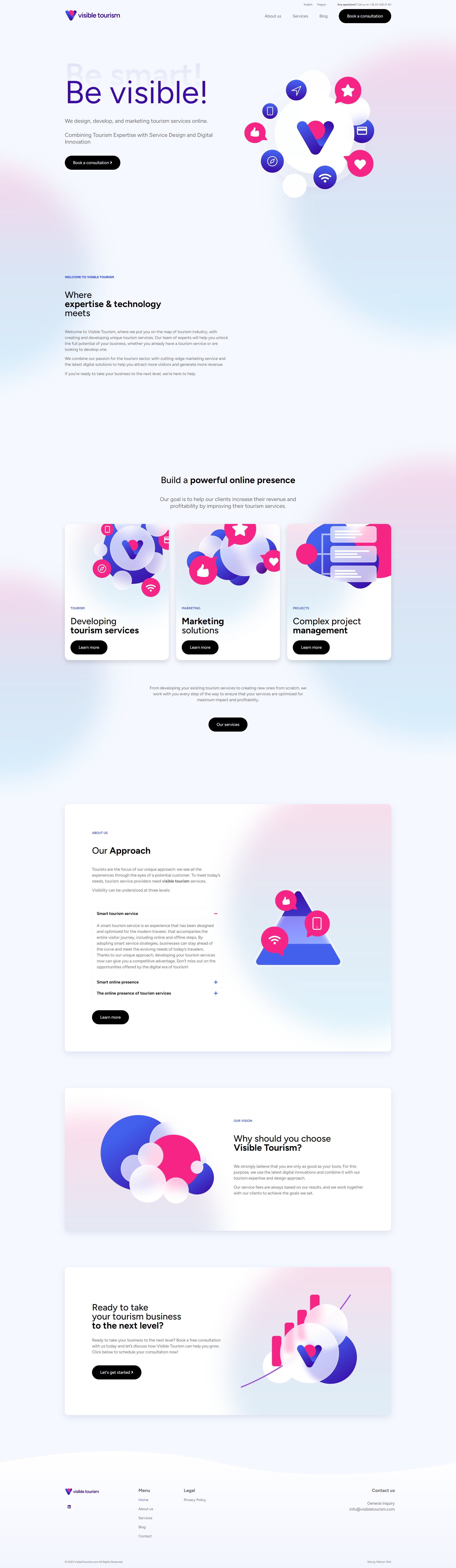
The Website
In line with the client’s request, the website design was kept simple yet engaging. We adhered to contemporary trends of minimalism, enhanced by friendly aesthetics and subtle effects, like the semi-transparent elements that had become a cornerstone of the design philosophy.
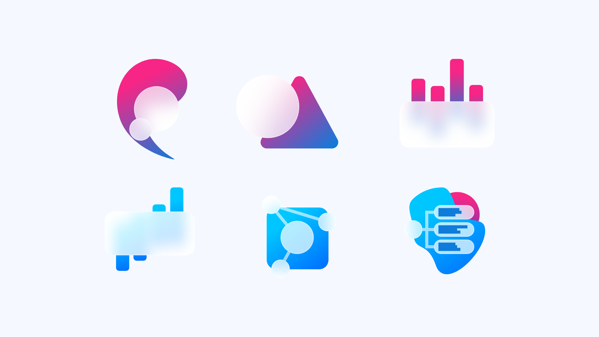
Given the time constraints, we developed a minimal yet effective UI Kit. This included illustrations in vector format, essential typographic elements, buttons, and user interface components, ensuring a consistent and intuitive user experience across the website.
The website was developed on WordPress, utilizing Elementor for ease of customization and WPML for multilingual support. To ensure the site’s security and efficiency, we integrated Wordfence, a cookie manager, and a cache plugin. This straightforward development approach resulted in a robust and user-friendly website.
WIREFRAMES
STYLE VARIATIONS
HOMEPAGE WITH THE FINISHED ILLUSTRATIONS AND COLORS
Summary
The design was an instant hit with the client. Their continued use of the branding and website stands as a testament to the project’s success.
This project showcases my ability to meet challenging deadlines without compromising on quality. The result was a brand and website that not only fulfilled the client’s immediate needs but also laid a strong foundation for their future marketing efforts.